Care Coalition

Care Coalition addresses the gaps in mental health care that leave families overwhelmed and providers without clear tools to coordinate care. Through structured support and the Guardian Model, it equips families and professionals with the tools to navigate care with clarity and confidence. More than a support resource, it is a movement to make mental health care more connected, responsive, and human.
BRANDING, WEBSITE, BRANDED ASSETS
The Direction
The Care Coalition brand reflects Mike’s commitment to making complex systems easier for families to navigate, emphasizing clarity, empowerment, and simple, actionable steps. Visually aligned with his Guardian ad Litem Services brand, it builds on the existing teal palette with calming yet energizing accents—creating a more modern, approachable identity that feels both supportive and action-oriented.
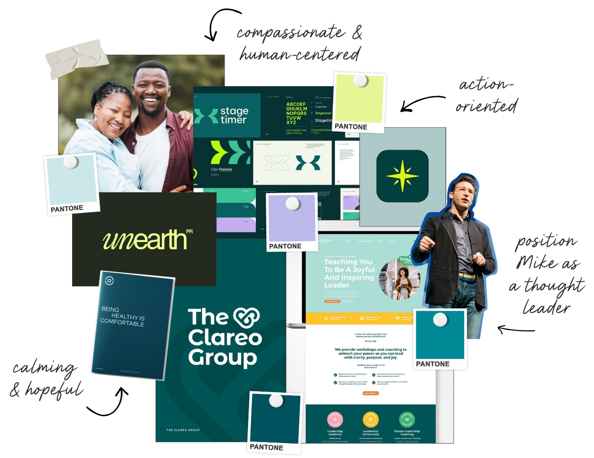
The wordmark does a lot of quiet work. The mix of script and bold sans-serif balances the human side of the brand with the credibility the work demands. And that angled cut at the top of the L? A subtle nod to a compass arrow, because at its core, Care Coalition exists to help people find their way through a system that wasn't built with them in mind.
The stacked version with the tagline, bringing the Guardian Model into the brand identity and grounding the visual in the proven framework behind the work.

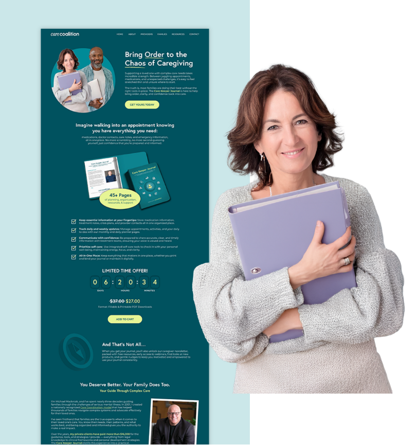
Before any campaigns, we started with the foundation. The founder had years of resources built up that needed a home. We organized everything into a single, structured planner families could actually use to keep track of everything related to their loved one's care. Existing resources got a brand refresh, gaps got filled with new ones, and the result was the Care Keeper Journal.

The journal came out to 45+ pages covering everything from educational content to planning and tracking pages to contact sheets. Every page was designed for print and built as a fillable PDF for families who wanted to keep a digital copy.

On the provider side, we built out presentation templates to give the existing training materials a refresh they weren't getting any traction without. Together, the journal and the trainings cover both sides of the care team that need to be working in sync.

While the materials came together, so did the website. The priority was simple navigation, messaging that actually landed with both families and providers, and a space that felt trustworthy enough to introduce a new brand backed by years of real experience and research.
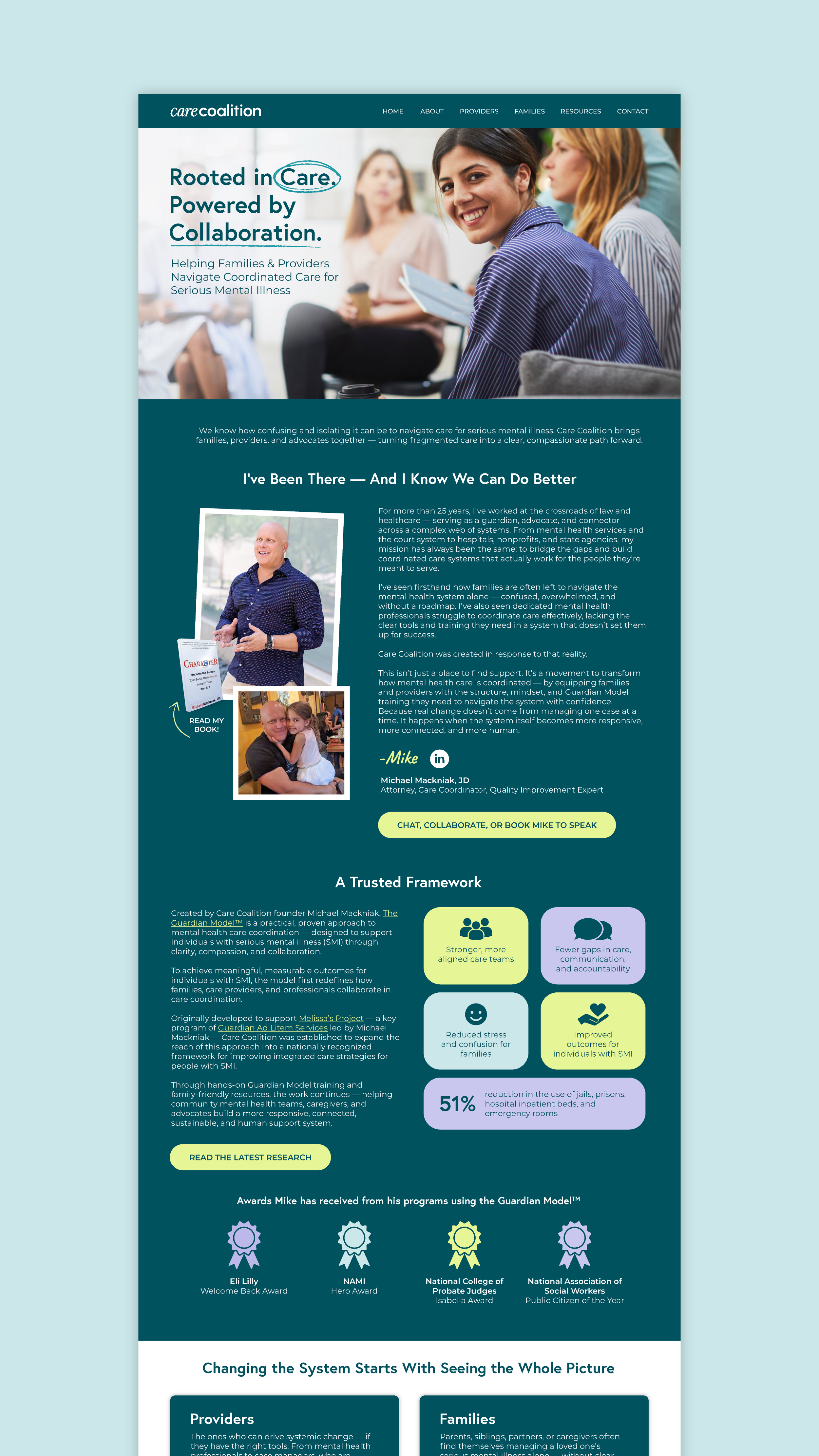
The about page does the heavy lifting of establishing credibility, telling Mike's story, introducing the Guardian Model, and laying out the research and recognition behind it.

The families page speaks directly to the exhaustion of navigating a complex system. The Care Keeper Journal is positioned as the answer to the pain points families know all too well.

The providers page meets professionals where they are: stretched thin, navigating complex cases without enough time or tools to do it well. The Care Coalition training is positioned as the solution built for exactly that.
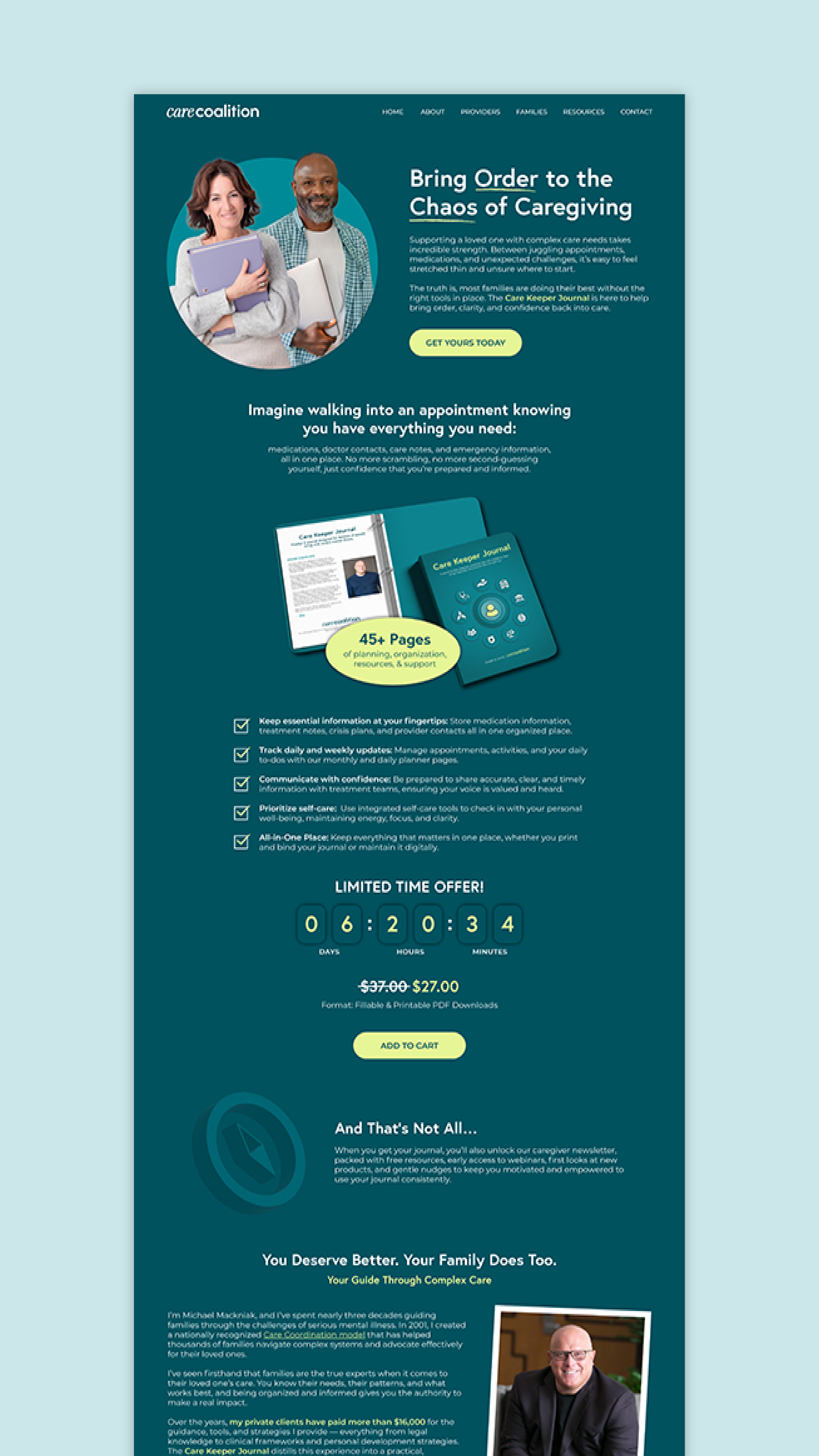
The Care Keeper landing page breaks down everything inside the journal and makes the case for why families need it. It did a lot of the selling work as the product launched.

The blog is designed and ready to go, built to become a content hub as Care Coalition continues to grow.
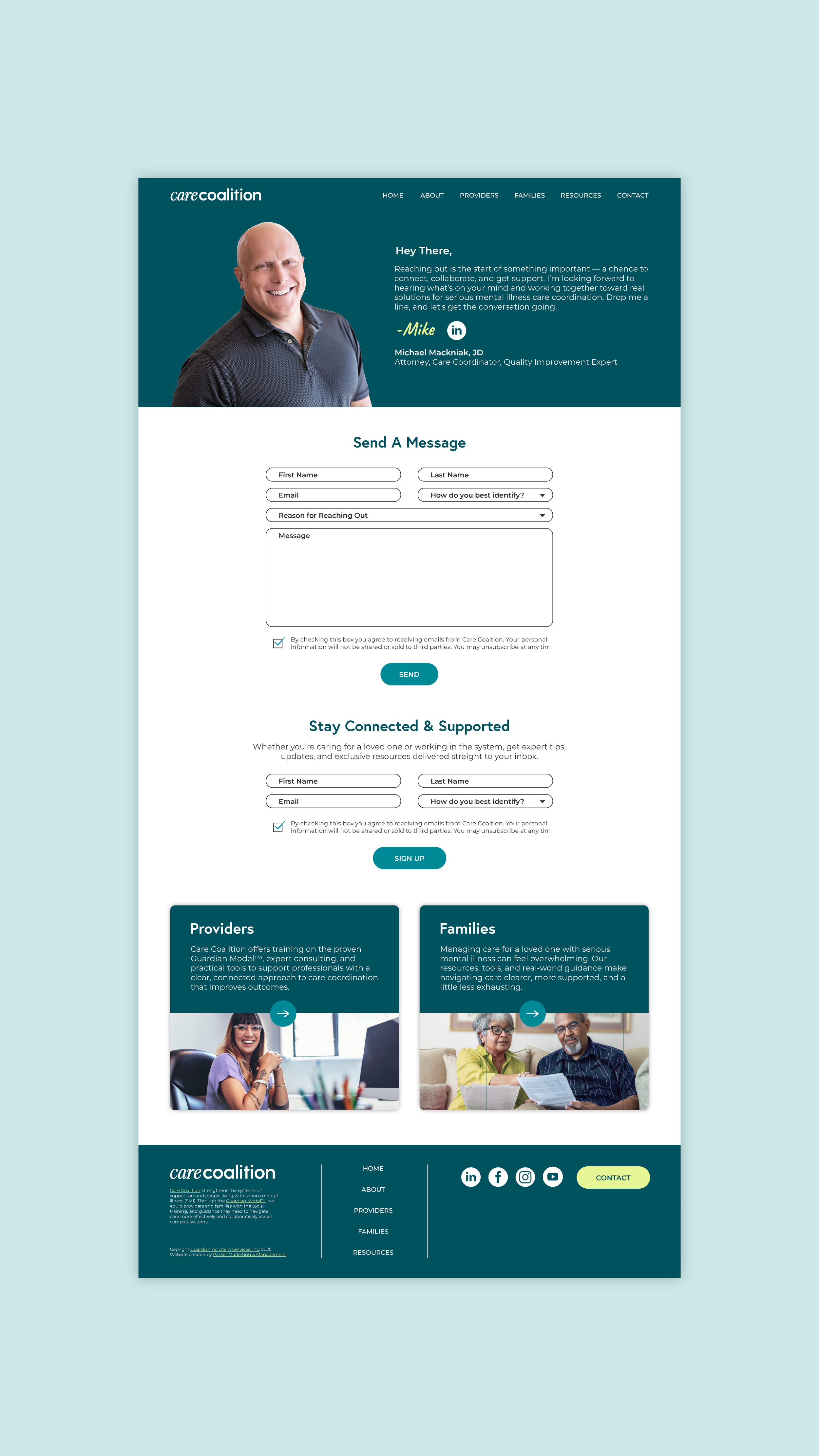
The contact page keeps the same warm tone as the rest of the site, whether someone is ready to book a consultation with Mike or exploring a collaboration.
Impact
After working for years with several different marketing agencies, Care Coalition was finally brought to life in the way Mike had envisioned. And there was for the first time a sellable product that could truly transform the way families coordinate care for their loved ones without burnout.